ao
2020
HAIR SALON
LOGO
HARAJUKU, TOKYO
HAIR SALON
LOGO
HARAJUKU, TOKYO
Nestled in the fashionable Omotesando district of Harajuku, the salon AO expresses the creativity of their clients through hair. AO, along with SUN and ACA, opened following the success of the flagship salon SOCO in Daikanyama, Tokyo. At the core of SOCO is their motto: "CREATE FUN, CREATE ANEW." While each salon and its logo are tailored to the neighborhood it serves, the desire to foster diversity is constant.
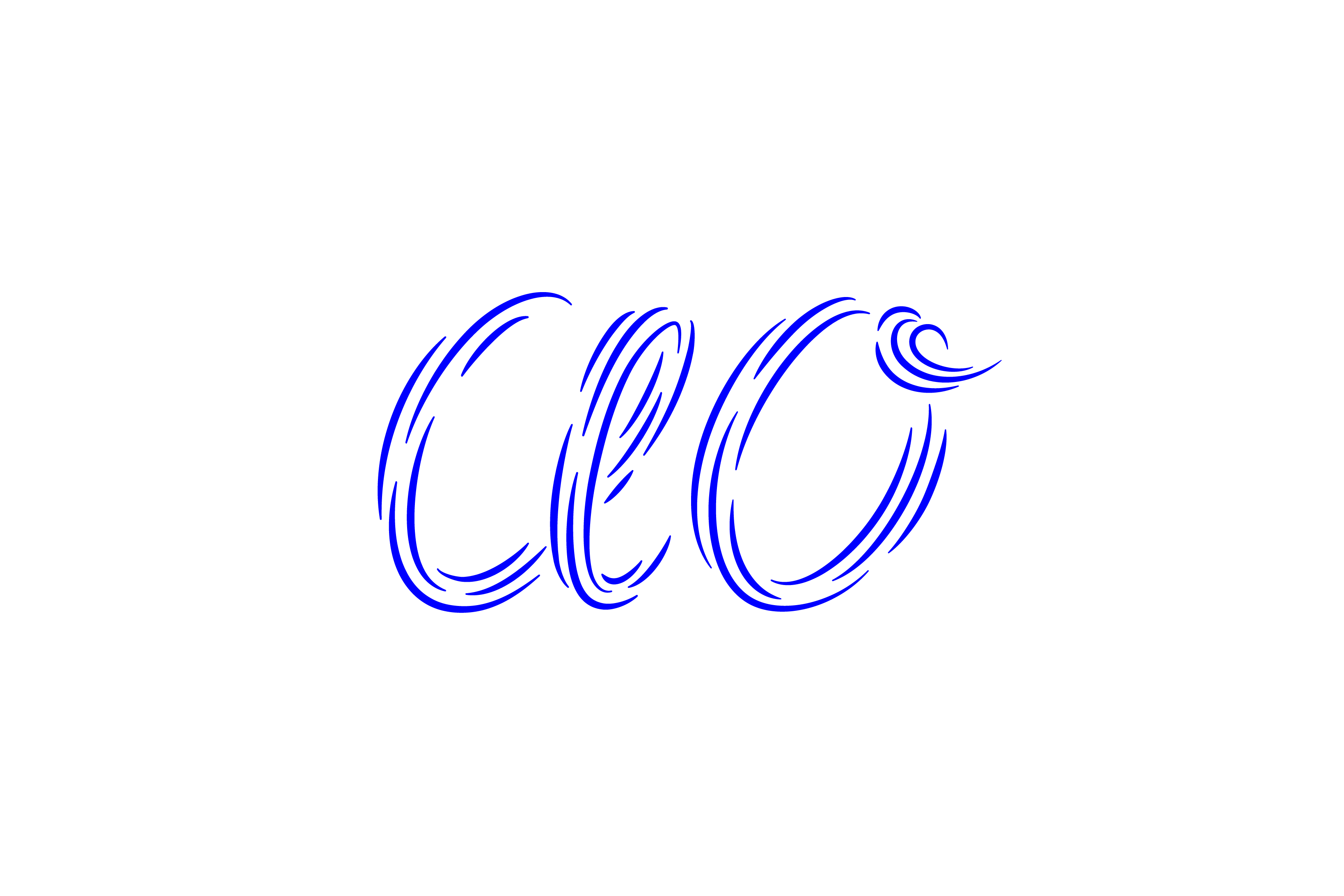
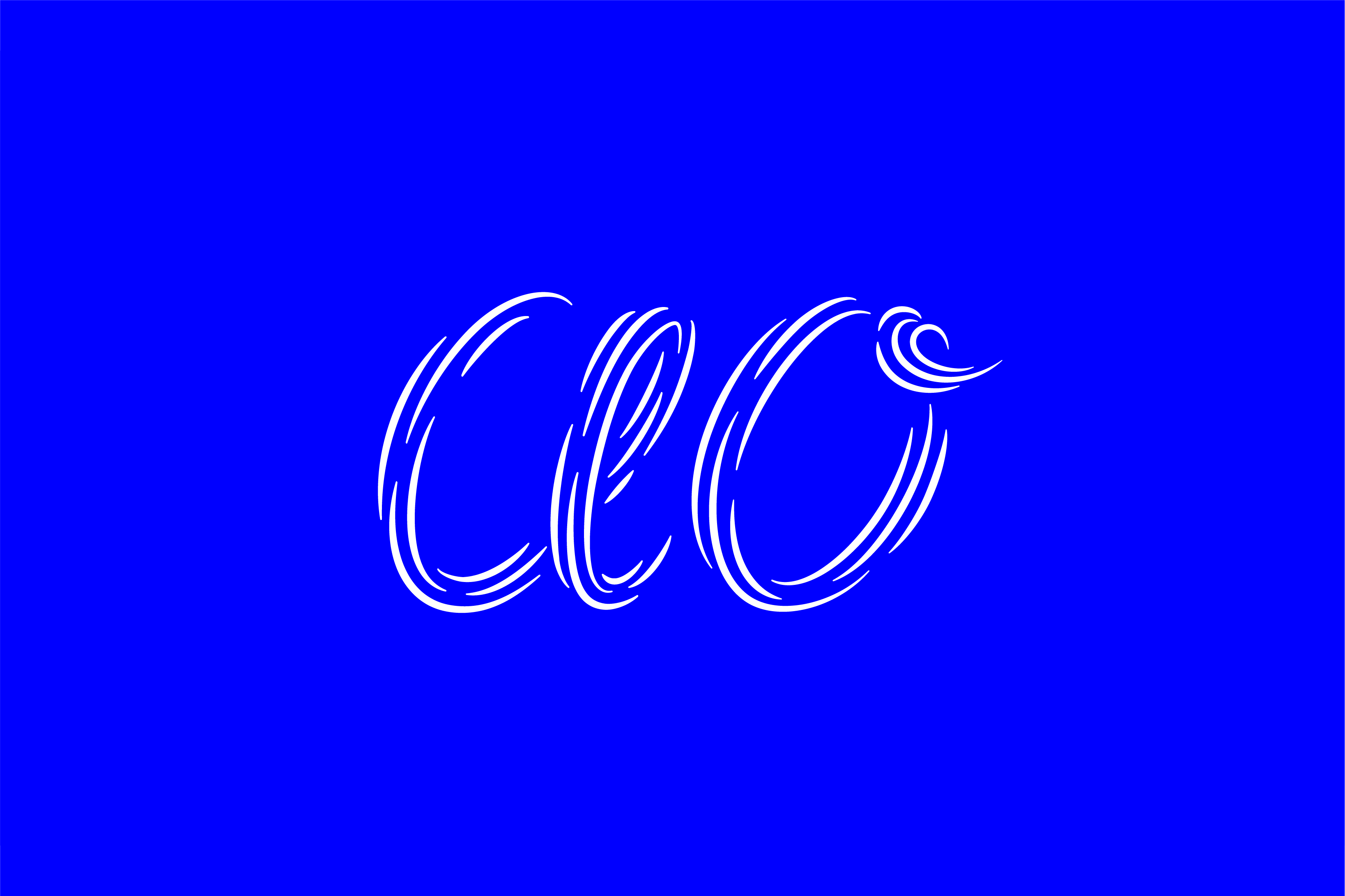
Omotesando, where AO resides, is a hub for the newest and original fashion. Swirling lines spell "AO," embodying currents, as well as flowing hair. Feminine and light-hearted, the logo captures the spirit of Harajuku.
This project was realized at COMMUNE under the art direction of Ryo Ueda.
Omotesando, where AO resides, is a hub for the newest and original fashion. Swirling lines spell "AO," embodying currents, as well as flowing hair. Feminine and light-hearted, the logo captures the spirit of Harajuku.
This project was realized at COMMUNE under the art direction of Ryo Ueda.
原宿のお洒落な表参道にあるヘアサロン「AO」。
AOは、東京・代官山のSOCOの成功を受けて、SUN、ACAとオープンしました。SOCOのモットーは "CREATE FUN, CREATE ANEW"。SOCOのグループのサロンは、髪を通じた生き生きや創造性を表現することを目的としています。 それぞれのサロンやロゴは近所に合わせて作られていますが、多様性を育むという思いは変わりません。
AOが存在する表参道は、最新かつ独創的なファッションの発信地。渦巻く線は「AO」を表現し、その動的な心と、流れるような髪の毛を体現しています。フェミニンで気が軽い原宿のスピリットを表現しています。
このワークスは上田亮のアートディレクションのもと、COMMUNEで実現しました。
CREDITS
CLIENT
_SOCO
BRANDING
_COMMUNE
CREATIVE DIRECTION
_RYO UEDA
ART DIRECTION
_RYO UEDA
_SOCO
BRANDING
_COMMUNE
CREATIVE DIRECTION
_RYO UEDA
ART DIRECTION
_RYO UEDA
DESIGN
_ANNA PETEK
_RYO UEDA
_NOÉMIE KAWAKITA*
_YUJI YANOU*
_HOLDEN KAO*
_ANNA PETEK
_RYO UEDA
_NOÉMIE KAWAKITA*
_YUJI YANOU*
_HOLDEN KAO*
*contributed to works not shown